
‘Hey! Look over here. We’ve built a business we’re proud of and want you as a customer that we can work hard for!’
That’s what great curb appeal screams to passersby.
Dirty windows, recycle bins and garbage, signs with missing letters, chipped paint, old remnants of scotch tape on glass and even ‘bleakness’ screams ‘nothing to see here’. There is a golden rule that applies to window design but in truth, it applies to all things business—don’t design for the merchandise, design for the human customer.
Our peripheral vision controls our central vision. A thousand years ago, a hunter would cook his dinner over an open fire but be alerted ‘out of the corner of his eye’ to something moving in the bushes—which would pull his focus (central vision) to investigate.
Humans walking and driving need to have their attention and focus ‘pulled’.
How to Increase Curb Appeal and Attract Customers
SIGNS:
- Include a sign that projects out from the façade in addition to your overhead flush-to-wall sign. A driver doesn’t drive by your business looking left or right and a walker looks straight ahead, too—a sign needs to face and interrupt them.
- Sidewalk signs can be placed as ‘interrupters’.
- Use LARGE print. The farther away, the smaller print appears so what looks big
up-close is barely readable across the road. Less text is more. Dark font on light
backing wins for visibility and a red border boosts readership. - Incorporating creativity increases intrigue. A kitchen store with its overhead sign made out of a table top and plates; a furniture store using twigs bound together for lettering; a manufacturer using cogs or metal machine parts. Humans see that effort as a fabulously interesting wrapped gift they can’t wait to open!
MOVEMENT AND LIGHT:
- Yes, those big colourful blowing flags, banners, balloons and kites work! A train rolling down the track in the window or a fan, spinning mobile, digital screen, flashing light, scrolling letters, giant bobble-headed barking dog—be alive and motioning to the outside world.
- Lighting creates needed three-dimensional interruption from a flat surface, is mood setting and attention getting. Your exterior can never stand out as much as when people are driving by at night—light it up like Broadway! Check out Finkle Electric at night!
COLOUR:
- Your door must stand out from the rest of the exterior and your exterior must stand out from your neighbours. It’s nice to be classy or ‘appropriate’ (high end store with sleek colour scheme) but if you count on foot traffic, you need more punch than greys and flat tones.
INSIDE OUT:
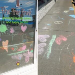
- Bring a taste of ‘what you’ll find inside’ outside. Below is the window and sidewalk outside The Tree Trunk, a trendy baby and toddler store in Belleville. Spectacular!
- Bike or sports store? Have a bike rack. Flower store? Don’t just display baskets or flower boxes. ‘Plant’ how-to care tips or product education on bright sticks to showcase your knowledge and slow walkers down.
- Restaurants: play music outdoors, research scent marketing if you can’t pipe your own ovens’ / bakeshop aroma outdoors.
- Reno store: display ‘step-by-step’ project boards.
Check The Back Door:
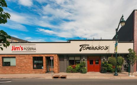
- Every entrance / exposure to your business needs to wow. A customer may love your entrance but will be disappointed by a dark, dirty parking lot. Tomasso’s has a beautifully designed street entrance, waterside patio (with projected sign) and clean, well-lit parking.

Next in the 3-Part Customer Appeal Series:
Keep your eyes peeled for ‘Storefront Window Displays Attract Shoppers’ followed by ‘Interior Traffic Planograms For Selling to Humans.’
Alison Davies is a local business advisor; you can get in touch with her at www.alisondavies.ca or [email protected]
Be sure to check out our events calendar, follow us on Facebook, Instagram and Twitter and sign up for our newsletter for more of what happens here in the BoQ.